Brand Strategy
Water.io
In a sea of smart water bottles, how do we make a splash in the global wellness scene? Not everyone gets the need for hydration, and those that do don't always want to spend on another notification or tracking device to get them to do it. This is the story of Water.io's glow up from just another drinking canister, to technological hydration advocate, to your favorite betterment buddy
Branding
BRAND STRATEGY
In a sea of smart water bottles, how do we make a splash in the global wellness scene? Not everyone gets the need for hydration, and those that do don't always want to spend on another notification or tracking device to get them to do it. This is the story of Water.io's glow up from just another drinking canister, to technological hydration advocate, to your favorite betterment buddy
LOGO
We've tweaked the Water.io logo to enhance its fluidity while keeping its original charm. It's updated to be smoother and more dynamic, hinting at both the natural flow of water and our cutting-edge tech. This refreshed look keeps it fun and modern, perfectly aligning with the evolving Water.io brand.
BRAND IDENTITY
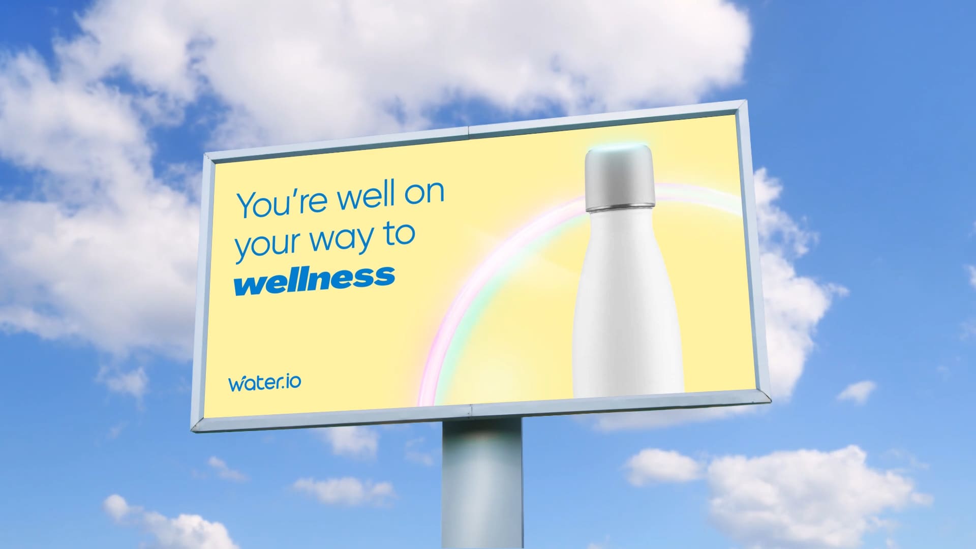
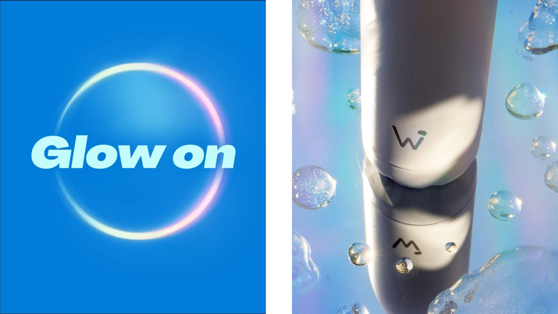
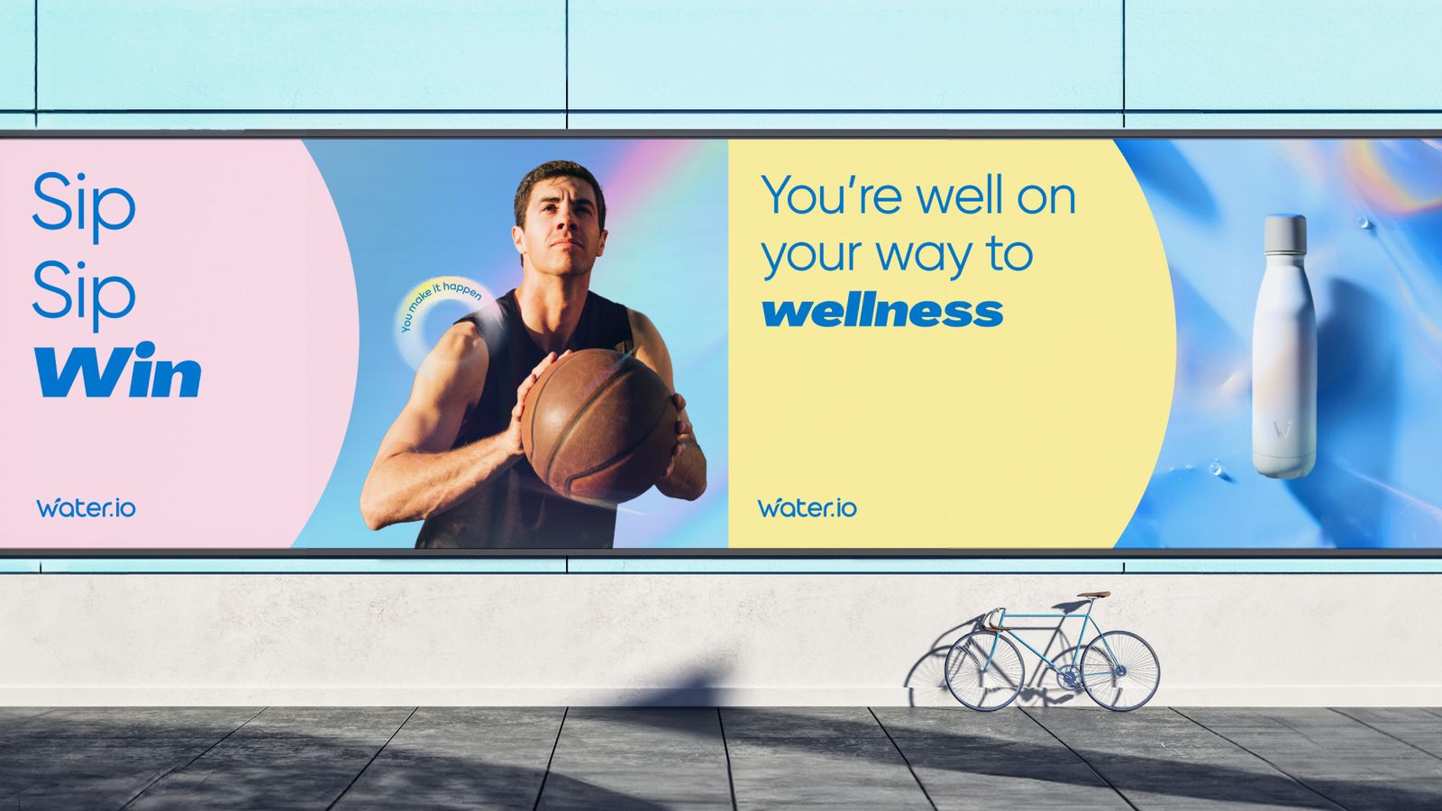
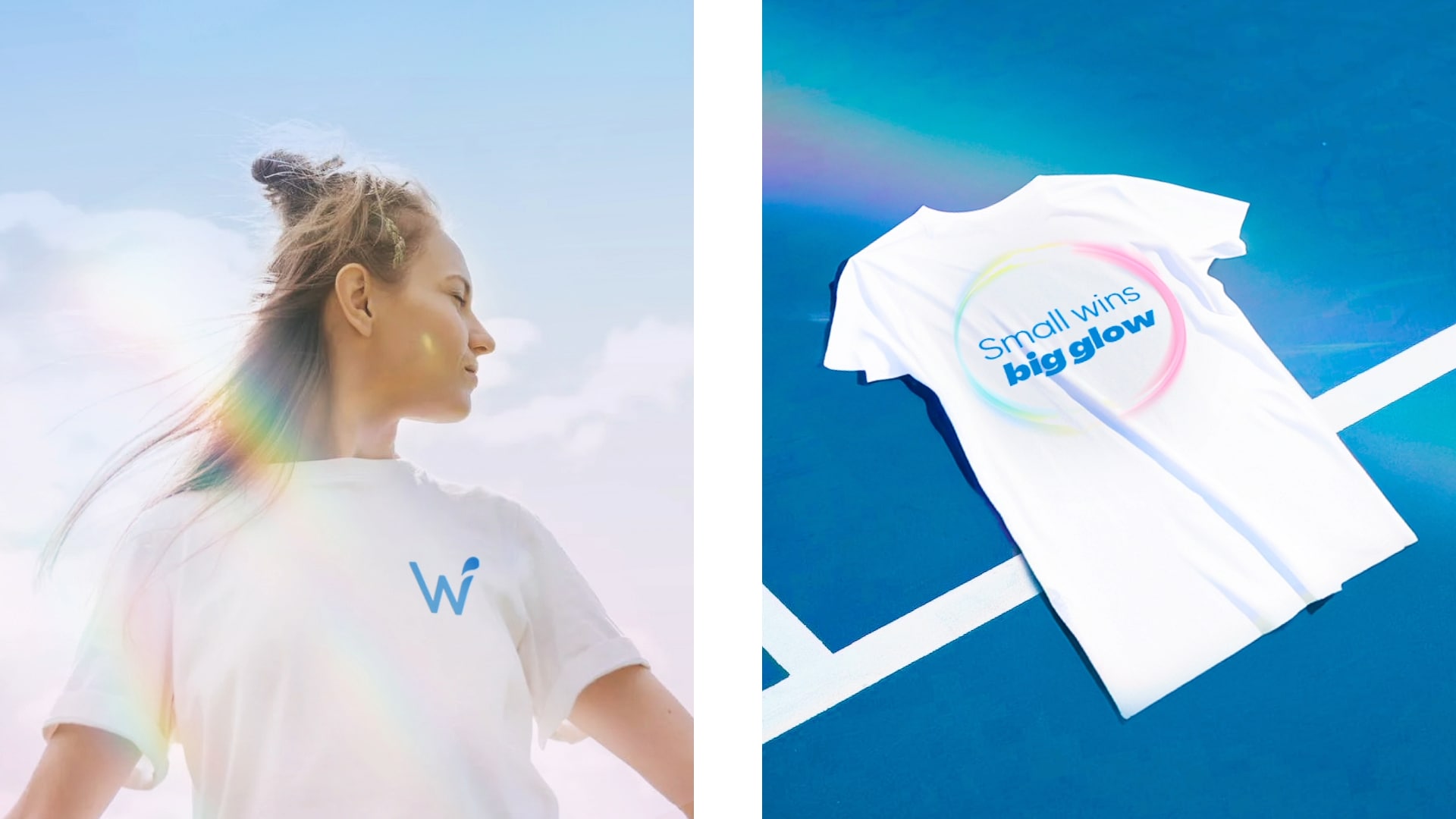
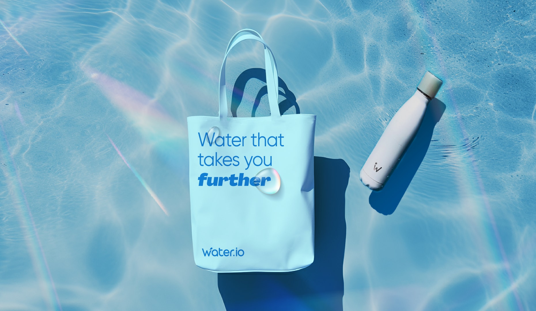
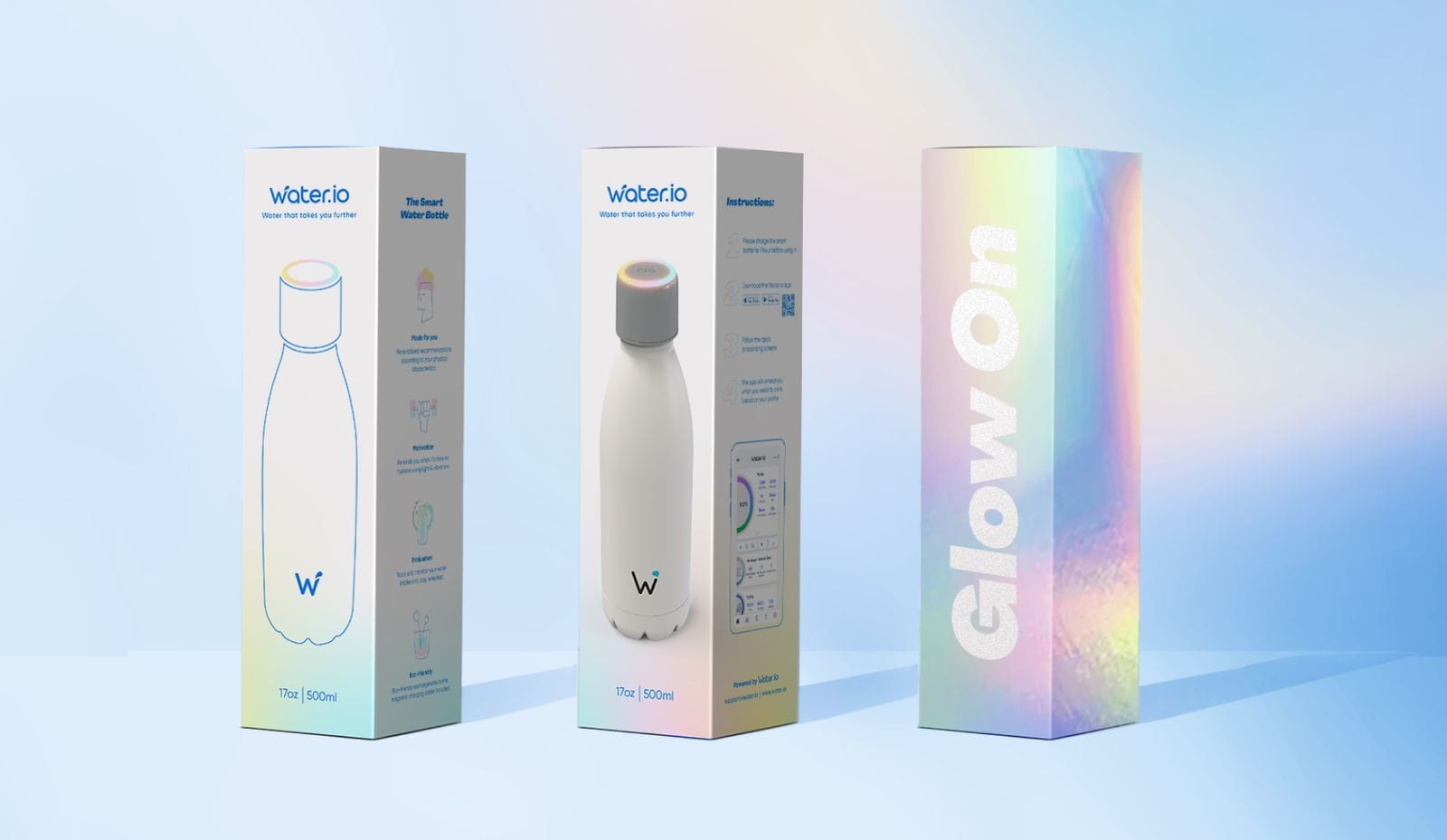
Water.io's revamped brand identity mirrors the energy of our "Your H2O Glow" strategy. Inspired by water refractions and the rainbow that celebrates your hydration achievements, our design is both fun and functional. More than a smart bottle, it's a sleek accessory that complements your daily life and underscores your health goals. With its clean, modern look and subtle water motifs, every sip with Water.io not only hydrates but also connects you to a healthier, more vibrant lifestyle.
BRAND ELEMENTS
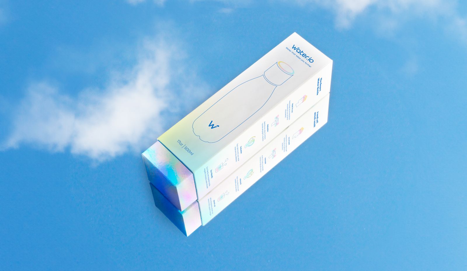
Water.io's branding is distinguished by our vibrant "ripple of wellness" color motif, inspired by the rainbow effect visible on our bottle when hydration goals are met. This dynamic color palette is consistently applied across all elements, reinforcing our commitment to health and creating a cohesive, visually compelling identity. To further simplify and demystify our smart bottle technology, we employ a minimalist illustration language. Positioned subtly within our branding hierarchy, these illustrations engage users by breaking down complex features into accessible visuals, enhancing understanding and interaction with the product.


